Bumbel: A Playful Display Font That Pops on the Web
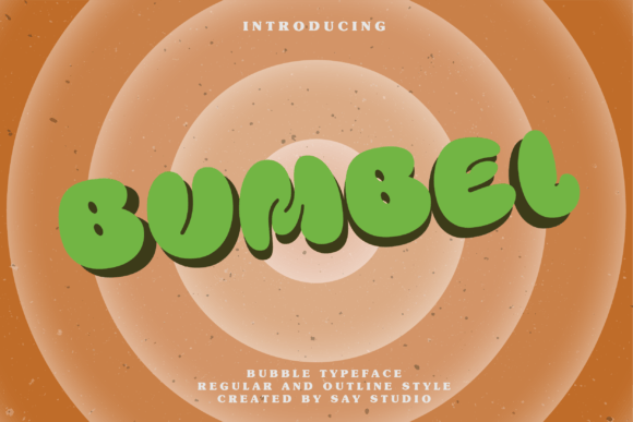
It started with a hero section that felt… safe. Too safe. I was refining a landing page for a creative coaching brand—soft colors, clean layout, strong messaging—but the headline just sat there, polite and unmemorable. So I swapped in Bumbel. Instantly, the energy shifted. Not louder, exactly—but *alive*. Like bubbles rising through soda: buoyant, organic, full of quiet motion. That’s when I knew this wasn’t just another decorative display font—it was a deliberate mood-setter.
What Bumbel Brings to Digital Layouts
Bumbel is a premium display font built around joyful tension—the kind you get from rounded forms that still hold crisp definition, soft curves that never collapse into fuzziness, and letter spacing that breathes without drifting. It’s not cartoonish, nor is it sterile. It’s modern typography with personality: friendly but confident, playful but intentional. As a web designer, I look for fonts that support storytelling—not distract from it—and Bumbel does that beautifully in visual hierarchy. It doesn’t shout; it invites attention with charm.
Real-World Testing Across Devices and Contexts
I tested Bumbel across several real project scenarios: a boutique online store banner, a course sales page headline, a portfolio site hero, and a digital brand kit preview. On desktop, it shines at 48–72px—especially over subtle gradients or soft-focus background images. The rounded terminals and open counters keep it legible even with light-weight overlays. On mobile? I used it at 36px in a bold weight (where available) for the main CTA headline—no blurring, no rendering hiccups in Chrome or Safari. It held up cleanly even on lower-DPI Android devices when served as a properly optimized WOFF2 file.
One surprise was how well it worked over dark backgrounds. Many bubbly or rounded display fonts lose contrast or feel “muddy” against black or charcoal. Bumbel’s generous x-height and consistent stroke contrast kept it punchy and readable—even at smaller sizes in secondary headings (like H2s at 28px).
Where Bumbel Excels—and Where to Pause
Bumbel is ideal for:
- Hero headlines and section titles — especially on lifestyle, creative, wellness, or boutique brand sites
- Call-to-action buttons — when styled with ample padding and balanced weight (avoid ultra-thin variants here)
- Logo lockups or wordmarks — its distinctive rhythm makes it memorable at small scales (tested down to 24px in favicon-sized previews)
- Digital ads and social banners — it scans quickly and stands out in crowded feeds
- Branded illustrations or animated text reveals — those bubble-inspired shapes translate beautifully to micro-interactions
But let’s be practical: Bumbel isn’t meant for body copy, navigation menus, form labels, or dense dashboard interfaces. Its decorative nature means low contrast in thin weights and tighter tracking can compromise accessibility—especially for users relying on screen readers or zoomed-in views. I wouldn’t use it for paragraph text, legal disclaimers, or anything requiring WCAG AA compliance at small sizes. And while it handles short phrases like “Start Your Journey” or “New Collection” flawlessly, avoid stacking more than two lines of Bumbel in tight layouts—it needs room to breathe.
Smart Pairing for Balanced Digital Branding
Pairing Bumbel thoughtfully is where it truly sings. I consistently paired it with a neutral, highly legible sans serif—like Inter, Manrope, or even system stacks (e.g., -apple-system, BlinkMacSystemFont) for body text and UI elements. That contrast creates instant visual rhythm: Bumbel brings warmth and voice; the sans serif delivers clarity and trust. For a more editorial or elevated feel—say, on a blog-integrated brand site—I tested Bumbel with a gentle serif like Lora or Cormorant Garamond for pull quotes or subheads. The result felt curated, not chaotic.
Crucially, I checked what styles were included before implementation: at minimum, a Bold and Regular weight (with OpenType features like stylistic alternates). Some versions include swashes or contextual ligatures—lovely for hero text animations, but unnecessary for most functional uses. Always verify webfont licensing: commercial use is standard, but confirm whether self-hosting, CDN delivery, or variable font support is included—especially if you’re building client sites or SaaS dashboards.
Final Notes for Real Projects
If you're choosing Bumbel for a live site, start small: apply it to one high-impact element first (like your primary headline), test across devices, and check loading performance—especially if serving multiple weights. Consider using font-display: swap to avoid invisible text during load. Also, preview how it renders alongside icons, illustrations, and photography—Bumbel’s bubbly dynamism works best when surrounded by space or soft edges, not competing with busy patterns or sharp geometric graphics.
Most importantly: Bumbel isn’t about trend-chasing. It’s about intention. When your brand values approachability, creativity, and human-centered design, Bumbel becomes more than a typeface—it becomes part of your tone. It’s the difference between saying something—and making someone smile before they even read the first word.