Amsyong: A Playful Display Font for Child-Friendly Digital Experiences
As a UI designer who builds landing pages, SaaS onboarding flows, and boutique e-commerce sites, I reach for display fonts like Amsyong when the goal is warmth, approachability, and instant emotional resonance—especially with younger audiences or brands rooted in creativity, learning, or play. Amsyong isn’t built for long paragraphs or dense interface labels. It’s designed to shine where personality matters most: hero headlines, product badges, course titles, and branded banners that need to feel human before they’re even read.
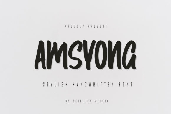
Visually, Amsyong balances rounded geometry with subtle bounce—soft curves, open counters, and gentle asymmetry give it a hand-crafted charm without sacrificing legibility at scale. Its letterforms avoid exaggerated whimsy, so it reads clearly even at 48px on mobile viewports. That makes it unusually versatile among children-themed display fonts: it supports joy without tipping into cartoonish overload, and it scales gracefully across responsive breakpoints—from desktop hero sections down to tablet-sized CTA buttons.
In practice, I use Amsyong for short, high-impact text elements where tone drives conversion. Think “Join the Adventure” above a sign-up form, “Summer Camp 2024” on an online course banner, or “Handmade with Love” on a kids’ apparel store homepage. It works especially well layered over soft gradients or bright solid backgrounds—its generous x-height and wide spacing hold up against texture and color noise. On dark mode interfaces, I pair it with a light fill and subtle text shadow for contrast; on image overlays, I apply a semi-opaque background bar behind the text to preserve readability without muting its energy.
Amsyong strengthens visual hierarchy by creating deliberate contrast—not just in size, but in voice. When paired with a neutral sans serif like Inter, Poppins, or Open Sans for body copy and navigation, it signals *this is the moment to pause and feel something*. That contrast helps users scan faster: eyes lock onto the playful headline first, then flow naturally to supporting content. For brand-focused web experiences—like a Montessori school’s site or a creative coding camp for ages 7–12—Amsyong becomes part of the identity architecture, reinforcing values like curiosity and kindness through typography alone.
It’s not ideal for UI components requiring precision: avoid using Amsyong for form labels, error messages, or tab navigation. Its personality is strongest in short phrases (under six words), logo lockups, section dividers, and social media graphics repurposed from web assets. In portfolio sites, I’ve used it for project category headers (“Storytime Apps”, “Early Learning Tools”)—it adds thematic cohesion without demanding attention away from case study visuals. For online stores selling educational toys or eco-friendly kids’ gear, Amsyong elevates product tags and seasonal promotions while keeping the overall layout clean and trustworthy.
Readability holds up well across devices—but only when used intentionally. On mobile, I cap Amsyong usage at 36–42px for headings and never drop below 28px, even with tracking adjustments. I avoid tight line-heights (<1.2) and always test against real device viewports. For buttons, I reserve Amsyong for primary CTAs in hero sections only—not secondary actions or footer links—because its rhythm slows scanning speed slightly. That’s fine when you want emphasis; it’s counterproductive when users need to act quickly.
Font pairing is where Amsyong truly earns its place in a digital type system. I consistently pair it with a highly legible, variable-weight sans serif for all functional text. For editorial-leaning sites—say, a parenting blog with research-backed articles—I’ll use a warm, low-contrast serif like Cormorant Garamond for pull quotes or subheads, letting Amsyong anchor the main title. The contrast between its friendly display character and the grounded neutrality of supporting type creates balance: expressive but never chaotic, distinctive but never distracting.
Amsyong ships as a modern webfont package with WOFF2 support, multiple weights (Light, Regular, Bold), and basic Latin multilingual coverage—including accented characters for Spanish, French, and German—making it viable for bilingual landing pages or EU-facing edtech tools. It includes stylistic alternates (like a dotted ‘i’ or swash ‘g’) that add nuance when used sparingly in logos or hero text. No variable axis, but the weight range gives enough flexibility for layered typographic systems without needing external interpolations.
Licensing is straightforward but essential to confirm before deployment. Amsyong is a commercial font, meaning it requires a web license for live sites—even personal portfolios or client landing pages hosted on platforms like Webflow or Shopify. Most vendors offer tiered plans covering pageviews or domains, and many include app embedding rights if you’re building companion iOS/Android experiences. Never self-host a font without verifying license scope: using it in a Figma design system is fine; serving it via @font-face on a high-traffic store without proper licensing risks compliance issues and undermines the foundry’s work.
Ultimately, Amsyong serves a precise role in modern web design: it’s the typographic equivalent of a thoughtful smile—warm, intentional, and instantly disarming. It doesn’t try to be everything. It excels where brand voice meets user emotion: in the first three seconds of a visit, in the header that makes a parent pause mid-scroll, in the banner that tells a child, “This is for you.” Used with restraint and paired with clarity, it transforms functional layouts into memorable, human-centered experiences—without sacrificing performance, accessibility, or professional polish.